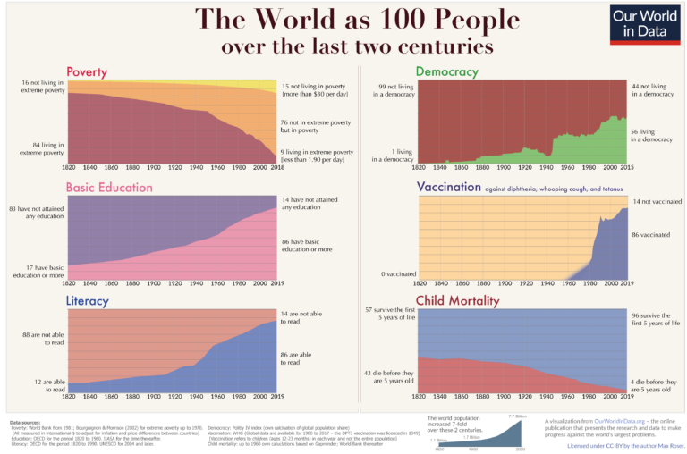
Global poverty is one of the most pressing problems that the world faces today. The poorest in the world are often undernourished, without access to basic services such as electricity and safe drinking water; they have less access to education, and suffer from much poorer health.
In order to make progress against such poverty in the future, we need to understand poverty around the world today and how it has changed.
On this page you can find all our data, visualizations and writing relating to poverty. This work aims to help you understand the scale of the problem today; where progress has been achieved and where it has not; what can be done to make progress against poverty in the future; and the methods behind the data on which this knowledge is based.
Key insights on Poverty
Measuring global poverty in an unequal world
There is no single definition of poverty. Our understanding of the extent of poverty and how it is changing depends on which definition we have in mind.
In particular, richer and poorer countries set very different poverty lines in order to measure poverty in a way that is informative and relevant to the level of incomes of their citizens.
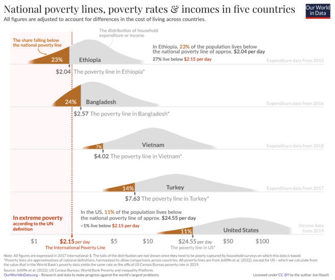
For instance, while in the United States a person is counted as being in poverty if they live on less than roughly $24.55 per day, in Ethiopia the poverty line is set more than 10 times lower – at $2.04 per day. You can read more about how these comparable national poverty lines are calculated in this footnote.1
To measure poverty globally, however, we need to apply a poverty line that is consistent across countries.
This is the goal of the International Poverty Line of $2.15 per day – shown in red in the chart – which is set by the World Bank and used by the UN to monitor extreme poverty around the world.
We see that, in global terms, this is an extremely low threshold indeed – set to reflect the poverty lines adopted nationally in the world’s poorest countries. It marks an incredibly low standard of living – a level of income much lower than just the cost of a healthy diet.
What you should know about this data
- Global poverty data relies on national household surveys that have differences affecting their comparability across countries or over time. Here the data for the US relates to incomes and the data for other countries relates to consumption expenditure.2
- The poverty lines here are an approximation of national definitions of poverty, made in order to allow comparisons across the countries.3
- Non-market sources of income, including food grown by subsistence farmers for their own consumption, are taken into account.4
- Data is measured in 2017 international-$, which means that inflation and differences in the cost of living across countries are taken into account.5
Global extreme poverty declined substantially over the last generation
Over the past generation extreme poverty declined hugely. This is one of the most important ways our world has changed over this time.
There are more than a billion fewer people living below the International Poverty Line of $2.15 per day today than in 1990. On average, the number declined by 47 million every year, or 130,000 people each day.6
The scale of global poverty today, however, remains vast. The latest global estimates of extreme poverty are for 2019. In that year the World Bank estimates that around 650 million people – roughly one in twelve – were living on less than $2.15 a day.
What you should know about this data
- Extreme poverty here is defined according to the UN’s definition of living on less than $2.15 a day – an extremely low threshold needed to monitor and draw attention to the living conditions of the poorest around the world. Read more in our article, From $1.90 to $2.15 a day: the updated International Poverty Line.
- Global poverty data relies on national household surveys that have differences affecting their comparability across countries or over time.7
- Surveys are less frequently available in poorer countries and for earlier decades. To produce regional and global poverty estimates, the World Bank collates the closest survey for each country and projects the data forward or backwards to the year being estimated.8
- Non-market sources of income, including food grown by subsistence farmers for their own consumption, are taken into account.9
- Data is measured in 2017 international-$, which means that inflation and differences in the cost of living across countries are taken into account.10

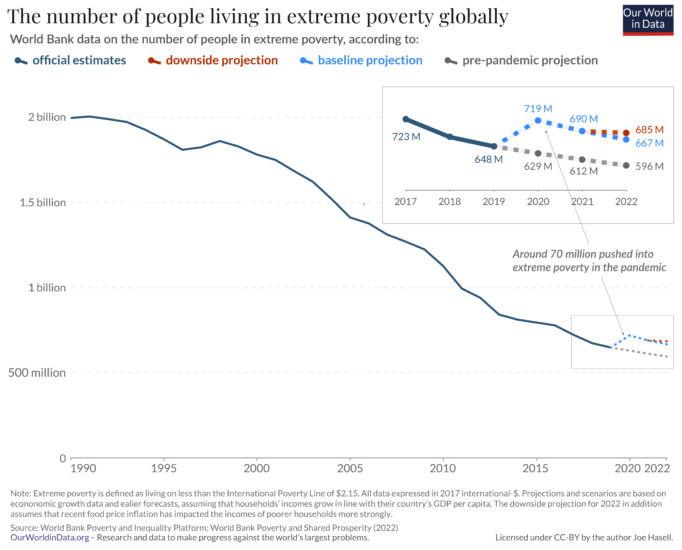
The pandemic pushed millions into extreme poverty
Official estimates for global poverty over the course of the Coronavirus pandemic are not yet available.
But it is clear that the global recession it brought about has had a terrible impact on the world’s poorest.
Preliminary estimates produced by researchers at the World Bank suggest that the number of people in extreme poverty rose by around 70 million in 2020 – the first substantial rise in a generation – and remains around 70-90 million higher than would have been expected in the pandemic’s absence. On these preliminary estimates, the global extreme poverty rate rose to around 9% in 2020.11
What you should know about this data
- Extreme poverty here is defined according to the UN’s definition of living on less than $2.15 a day – an extremely low threshold needed to monitor and draw attention to the living conditions of the poorest around the world. Read more in our article, From $1.90 to $2.15 a day: the updated International Poverty Line.
- Figures for 2020-2022 are preliminary estimates and projections by World Bank researchers, based on economic growth forecasts. The pre-pandemic projection is based on growth forecasts prior to the pandemic. You can read more about this data and the methods behind it in the World Bank’s Poverty and Shared Prosperity 2022 report.12
- Global poverty data relies on national household surveys that have differences affecting their comparability across countries or over time.13
- Surveys are less frequently available in poorer countries and for earlier decades. To produce regional and global poverty estimates, the World Bank collates the closest survey for each country and projects the data forward or backwards to the year being estimated.14
- Non-market sources of income, including food grown by subsistence farmers for their own consumption, are taken into account.15
- Data is measured in 2017 international-$, which means that inflation and differences in the cost of living across countries are taken into account.16
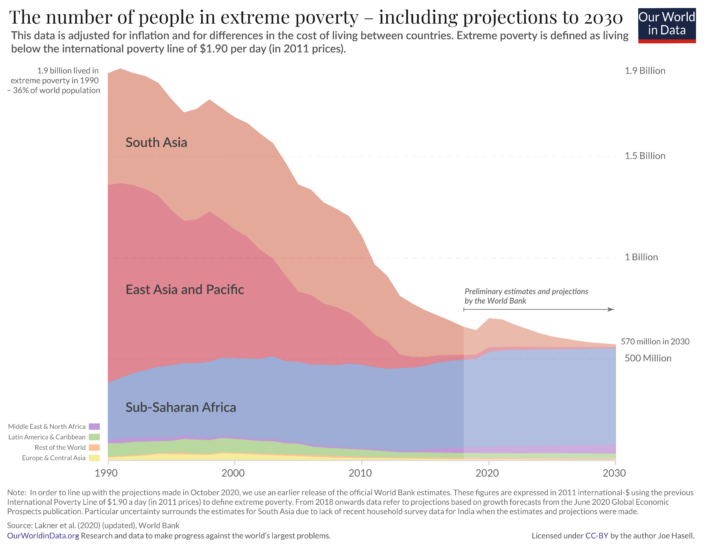
Hundreds of millions will remain in extreme poverty on current trends
Extreme poverty declined during the last generation because the majority of the poorest people on the planet lived in countries with strong economic growth – primarily in Asia.
The majority of the poorest now live in Sub-Saharan Africa, where weaker economic growth and high population growth in many countries has led to a rising number of people living in extreme poverty.
The chart here shows projections of global extreme poverty produced by World Bank researchers based on economic growth forecasts.17
A very bleak future is ahead of us should such weak economic growth in the world’s poorest countries continue – a future in which extreme poverty is the reality for hundreds of millions for many years to come.
What you should know about this data
- The extreme poverty estimates and projections shown here relate to a previous release of the World Bank’s poverty and inequality data in which incomes are expressed in 2011 international-$. The World Bank has since updated its methods, and now measures incomes in 2017 international-$. As part of this change, the International Poverty Line used to measure extreme poverty has also been updated: from $1.90 (in 2011 prices) to $2.15 (in 2017 prices).
This has had little effect on our overall understanding of poverty and inequality around the world. You can read more about this change and how it affected the World Bank estimates of poverty in our article From $1.90 to $2.15 a day: the updated International Poverty Line.
- Figures for 2018 and beyond are preliminary estimates and projections by Lakner et al. (2022), based on economic growth forecasts. You can read more about this data and the methods behind it in the related blog post.18
- Global poverty data relies on national household surveys that have differences affecting their comparability across countries or over time.19
- Surveys are less frequently available in poorer countries and for earlier decades. To produce regional and global poverty estimates, the World Bank collates the closest survey for each country and projects the data forward or backwards to the year being estimated.20
- Non-market sources of income, including food grown by subsistence farmers for their own consumption, are taken into account.21
- Data is measured in 2011 international-$, which means that inflation and differences in the cost of living across countries are taken into account.22
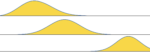
After 200 years of progress the fight against global poverty is just beginning
Over the past two centuries the world made good progress against extreme poverty. But only very recently has poverty fallen at higher poverty lines.
Global poverty rates at these higher lines remain very high:
- 25% of the world lives on less than $3.65 per day – a poverty line broadly reflective of the lines adopted in lower-middle income countries.
- 47% of the world lives on less than $6.85 per day – a poverty line broadly reflective of the lines adopted in upper-middle income countries.
- 84% live on less than $30 per day – a poverty line broadly reflective of the lines adopted in high income countries.27
Economic growth over the past two centuries has allowed the majority of the world to leave extreme poverty behind. But by the standards of today’s rich countries, the world remains very poor. If this should change, the world needs to achieve very substantial economic growth further still.

What you should know about this data
- The data from 1981 onwards is based on household surveys collated by the World Bank. Earlier figures are from Moatsos (2021), who extends the series backwards based on historical reconstructions of GDP per capita and inequality data.28
- All data is measured in international-$ which means that inflation and differences in purchasing power across countries are taken into account.29
The World Bank data for the higher poverty lines is measured in 2017 international-$. Recently, the World Bank updated its methodology having previously used 2011 international-$ to measure incomes and set poverty lines. The Moatsos (2021) historical series is based on the previously-used World Bank definition of extreme poverty – living on less than $1.90 a day when measured in 2011 international-$. This is broadly equivalent to the current World Bank definition of extreme poverty – living on less than $2.15 a day when measured in 2017 international-$. You can read more about this update to the World Bank’s methodology and how it has affected its estimates of poverty in our article From $1.90 to $2.15 a day: the updated International Poverty Line.
- The global poverty data shown from 1981 onwards relies on national household surveys that have differences affecting their comparability across countries or over time.30
- Such surveys are less frequently available in poorer countries and for earlier decades. To produce regional and global poverty estimates, the World Bank collates the closest survey for each country and projects the data forward or backwards to the year being estimated.31
- Non-market sources of income, including food grown by subsistence farmers for their own consumption, are taken into account. This is also true of the historical data – in producing historical estimates of GDP per capita on which these long-run estimates are based, economic historians take into account such non-market sources of income, as we discuss further in our article How do we know the history of extreme poverty?
Explore data on Poverty
About this data
All the data included in this explorer is available to download in GitHub, alongside a range of other poverty and inequality metrics.
Research & Writing
Global poverty over the long-run
Poverty & economic growth
More articles on Poverty
Interactive charts on Poverty
 Distribution of population between different poverty thresholdsmore thresholds
 Distribution of population between different poverty thresholdsHistorical estimates (Moatsos, 2021)
 How does extreme monetary poverty compare to multidimensional poverty?Current estimates
 Median income or consumption per day
 Multidimensional Poverty Index (MPI)Current estimates
 Number of people living in extreme povertyLine chart
 Poverty gap index at $2.15 per day
 Poverty: Share of population living on less than $1 a day
 Poverty: Share of population living on less than $3.65 a day
 Poverty: Share of population living on less than $6.85 a day
 Share in poverty relative to different poverty thresholds
 Share of population in multidimensional povertyCurrent estimates
 Share of population living in extreme povertyLine chart
 Share of population living in extreme poverty'Cost of basic needs' approach, Historical estimates (Moatsos, 2021), Stacked area chart
 The share and number of people living in extreme poverty
 Total population living in extreme poverty by world region
 Access to electricity vs. share in extreme poverty
 CO₂ emissions per capita vs. share in extreme poverty
 Cereal yield vs share in extreme poverty
 Child mortality vs. share in extreme poverty
 Children per woman vs. share living in extreme poverty
 Comparison of extreme poverty estimates, World Bank PIP vs Bradshaw & Mayhew (2011)
 Daily GDP per capita vs. mean income or consumption per dayDaily GDP per capita, with comparison lines
 Daily income of the poorest and richest decile
 Death rate from indoor air pollution vs. share in extreme poverty
 Death rate from unsafe water sources vs. share of population living in extreme poverty
 Distribution of population between different poverty thresholds
 Distribution of population between different poverty thresholdsfewer thresholds
 Energy use per capita vs. share in extreme poverty
 Expected years of schooling vs. share of population in extreme poverty
 Extreme poverty and child mortality
 GDP per capita2017 Int-$
 GDP per capita vs. Daily income of the poorest 10%
 GDP per capita vs. mean income or consumption per day
 GDP per capita vs. median income or consumption per day
 Global Hunger Index vs. share in extreme poverty
 Hidden Hunger Index vs. share in extreme poverty
 Intensity of multidimensional povertyCurrent estimates
 Intensity of multidimensional povertyHarmonized over time estimates
 Level of income: top 10% vs bottom 10%
 Mean income or consumption per day2017 Int-$
 Mean income or consumption per dayMarimekko
 Mean vs. median daily income
 Multidimensional Poverty Index (MPI)Harmonized over time estimates
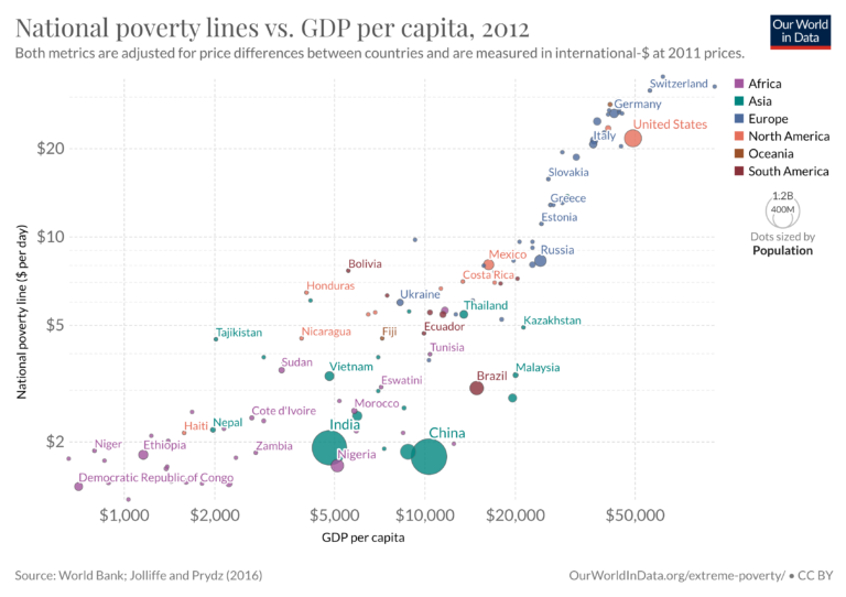
 National poverty line vs. GDP per capita
 National poverty line vs. GDP per capitaBy income group
 National poverty line vs. mean daily income or consumption
 National poverty line vs. median income or consumption per day
 Number of income/consumption surveys in the past decade available via the World Bank
 Number of people living in extreme povertyStacked area chart
 Number of people living in extreme poverty by regionHistorical estimates (Moatsos, 2021)
 Number of people living in extreme poverty by region'Cost of basic needs' approach, Historical estimates (Moatsos, 2021)
 Poverty: Share of population living on less than $10 a dayMarimekko
 Poverty: Share of population living on less than $10 a dayLine chart
 Poverty: Share of population living on less than $30 a day
 Poverty: Share of population living on less than $40 a day
 Prevalence of undernourishment vs. share in extreme poverty
 Prevalence of underweight children vs. share in extreme poverty
 Prevalence vs. intensity of multidimensional povertyCurrent estimates
 Relative poverty: Share of people below 40% of the median
 Relative poverty: Share of people below 50% of the median
 Relative poverty: Share of people below 60% of the median
 Share in extreme poverty vs. life expectancy at birth
 Share in extreme poverty vs. poverty gap index
 Share in extreme poverty: Cost of basic needs approach vs. living on less than $1.90 a dayHistorical estimates (Moatsos, 2021)
 Share in poverty relative to different poverty thresholdsHistorical estimates (Moatsos, 2021)
 Share in poverty vs. educational attainment
 Share in poverty vs. life expectancy
 Share living on less than $6.85 a day vs mean income or consumption
 Share of government consumption in GDP vs. share of population living in extreme poverty
 Share of gross national income donated toward poverty reduction
 Share of gross national income from poverty reduction grants
 Share of people at risk of falling into poverty if payment for surgical care is required
 Share of population below and above $30 per dayStacked bar: Above/below $30 per day
 Share of population in multidimensional povertyHarmonized over time estimates
 Share of population in multidimensional poverty: Urban vs. ruralHarmonized over time estimates
 Share of population in multidimensional poverty: Urban vs. ruralCurrent estimates
 Share of population living in extreme poverty'Cost of basic needs' approach, Historical estimates (Moatsos, 2021), Line chart
 Share of population living in extreme povertyHistorical estimates (Moatsos, 2021), Line chart
 Share of population living in extreme povertyHistorical estimates (Moatsos, 2021), Stacked area chart
 Share of population living in extreme povertyMarimekko
 Share of population living in extreme poverty vs GDP per capita
 Share of population living in extreme poverty vs. mean income or consumption per day
 Share of population living in poverty by national poverty lines
 Share of population living with less than $2.15 and $3.65 per day
 Share of population within different income thresholdsStacked bar: Above/below $30 per day
 Share of rural population living in poverty at national poverty lines
 Share of urban and rural population living in poverty by national poverty lines
 Share of urban population living in poverty at national poverty lines
 Share vs. intensity of multidimensional povertyHarmonized over time estimates
 The poverty gap
 Vaccination coverage vs. share in extreme poverty
 World population living in extreme povertyWorld Bank & Bourguignon and Morrisson