Notice: This is only a preliminary collection of relevant material
The data and research currently presented here is a preliminary collection or relevant material. We will further develop our work on this topic in the future (to cover it in the same detail as for example our entry on World Population Growth).
If you have expertise in this area and would like to contribute, apply here to join us as a researcher.
This entry presents the evidence on global economic inequality. It considers economic history and how global inequality has changed and is predicted to continue changing in the future.
A related entry on Our World in Data presents the empirical evidence of how income inequality has changed over time, and how the levels of inequality in different countries can vary significantly. It also presents some of the research on the factors driving the inequality of incomes.
Interactive charts on Global Economic Inequality


Living conditions are vastly unequal between different places in our world today. This is largely the consequence of the changes in the last two centuries: in some places living conditions changed dramatically, in others more slowly.
Our individual stories play out amidst these major global changes and inequalities and it is these circumstances that largely determine how healthy, wealthy, and educated each of us will be in our own lives.1 Yes, our own hard work and life choices matter. But as we will see in the data, these matter much less than the one big thing over which we have no control: where and when we are born. This single, utterly random, factor largely determines the conditions in which we live our lives.
Today’s global inequality is the consequence of two centuries of unequal progress. Some places have seen dramatic improvements, while others have not. It is on us today to even the odds and give everyone – no matter where they are born – the chance of a good life. This is not only right, but, as we will see below, is also realistic. Our hope for giving the next generations the chance to live a good life lies in broad development that makes possible for everyone what is only attainable for few today.
It strikes many people as inherently unfair that some people are able to enjoy healthy, wealthy, happy lives whilst others continue to live in ill-health, poverty and sorrow. For them it is the inequality in the outcomes of people’s lives that matters. For others it is the inequality in opportunity – the opportunity to achieve good outcomes – that is unfair. But the point of this text is to say that these two aspects of inequality are not separable. Tony Atkinson said it very clearly: “Inequality of outcome among today’s generation is the source of the unfair advantage received by the next generation. If we are concerned about equality of opportunity tomorrow, we need to be concerned about inequality of outcome today.”2
Today’s global inequality of opportunity means that what matters most for your living conditions is the good or bad luck of your place of birth.
The inequality between countries that I am focusing on in this text is not the only aspect that needs to be considered. Inequalities within countries and societies – regional differences, racial differences, gender differences, and inequalities across other dimensions – can also be large, and are all beyond any individual’s own control and unfair in the same way.
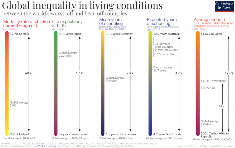
This visualization shows the inequality in living conditions between the worst and best-off countries in the world today in a number of aspects:
- Health: A child born in one of the countries with the worst health is 60-times more likely to die than a child born in a country with the best health. In several African countries more than one out of ten children born today will die before they are five years old. In the healthiest countries of the world – in Europe and East Asia – only 1 in 250 children will die before he or she is 5 years old.
- Here is the world map showing child mortality rates around the world.
- Education: In the countries where people have the best access to education – in Europe and North America – children of school entrance age today can expect 15 to 20 years of formal education. In Australia, which is an outlier, school life expectancy is 22.9 years. Children entering school at the same time in countries with the poorest access to education can only expect 5 years. And additionally, children tend to learn much less in schools in poorer countries, as we explained before.
- Here is the world map of expected years of schooling.
- Income: If you look at average incomes and compare the richest country – Qatar with a GDP per capita of almost $117,000 – to the poorest country in the world – the Central African Republic at $661 – then you find a 177-fold difference. This is taking into account price differences between countries and therefore expressed in international-$ (here is an explanation). Qatar and other very resource-rich economies might be considered outliers here, suggesting that it is more appropriate to compare countries that are very rich without relying mostly on exports of natural resources. The US has a GDP per capita of int.-$54,225 and Switzerland of 57,410 international-$. This means the Swiss can spend in 1 month what people in the Central African Republic can spend in 7 years.
- Here is the world map of GDP per capita differences.
The inequality between different places in the world is much larger than the difference you can make on your own. When you are born in a poor place where every tenth child dies you will not be able to get the odds of your baby dying down to the average level of countries with the best child health. In a place where the average child can only expect 5 years of education it will be immensely harder for a child to obtain the level of education even the average child gets in the best-off places.
The difference is even starker for incomes. In a place where GDP per capita is less than $1,000 and the majority lives in extreme poverty, the average incomes in a rich country are unattainable. Where you live isn’t just more important than all your other characteristics, it’s more important than everything else put together.
What is true for inequality across countries around the world today, is also true for change over time. What gives people the chance for a good life is when the entire society and economy around them changes for the better. This is what development and economic growth are about: transforming a place so that what was previously only attainable for the luckiest few comes into reach for most.
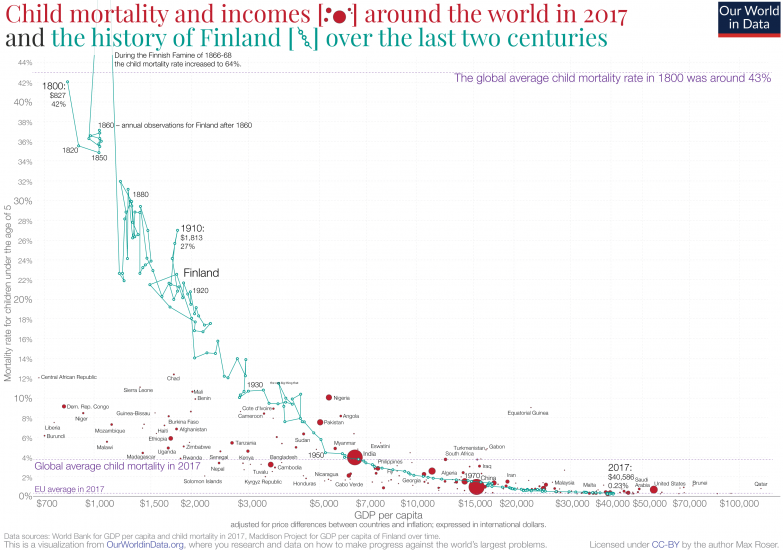
The blue line in this visualization shows this transformation of Finland, a country where people today are among the healthiest and richest in world history.
The datapoint in the top left corner describes life in Finland back in 1800 (a time when the country was not yet autonomous or independent). Of all children born that year 42% died in the first five years of their lives. And the average income in Finland was extremely low: GDP per capita was only $827 per year (this is adjusted for price increases to keep the purchasing power comparable to today). And similarly, even basic education was not available for most.
A society where almost half of all children died was not unusual: it was similarly high in humanity’s history until just very recently. The dashed purple line in the chart shows that around the world in 1800 a similarly high share of children died before they had their fifth birthday. At that time there was little global inequality; life was short everywhere and no matter where a child was born, chances were high that he or she would die soon.
And just as there was little inequality in mortality and health between different places around the world, there was also little inequality within countries. The health of the entire society was bad. We have data on the mortality of the English aristocracy from 1550 onwards. Aristocrats died just as early as everyone else.3 Their life expectancy was below 40 years too. Before broader social development even the most privileged status within society would not give you the chance for a healthy life. You just cannot be healthy in an unhealthy place.
Development and global inequality
After two centuries of slow, but persistent transformation, Finland is today one of the healthiest and wealthiest places in the world. It wasn’t smooth progress – during the Finnish Famine in the 1860s the mortality rate increased to over half – but gradually child health improved and today the child mortality rate is 0.23%. Within two centuries, the chances of a Finnish child surviving to the first five years of its life increased from 58% to 99.77%.
The same is true for income. Back in 1800, global inequality between countries was much lower than it is today. Even in those countries that are today the richest in the world the majority of people lived in extreme poverty until recently. Finland was no exception.
The red bubbles in the same chart show child mortality and incomes around the world today. It is the same data that we discussed above in the discussion on the extent of global inequality today, but now you see the data for all the world’s countries, not just the worst- and best-off.
Until around 1800, today’s best-off places were as poor as today’s worst-off places, and child mortality was even worse. All were in the top-left corner of the chart. What created the global inequality we see today were the large cross-country differences in improvements in health and economic growth over the last two centuries. Angus Deaton referred to this as the ‘Great Escape’. He wrote a book about it with this title in which he chronicles how some parts of the world escaped the worst poverty and disease, while others lagged behind.
Without looking at the data it is not possible to understand just how dramatically the prosperity and health of a society can be transformed. The health and prosperity in the past was so very bad that no one in Finland could have imagined living the life that is today the reality for the average person in Finland.
Even the countries where health and access to education are worst today have made progress in these dimensions. In the first chart of this text I added the estimates for the global average for each dimension two centuries ago underneath each scale. In terms of health, even today’s worst off places are faring better than the best-off places in the past. Here is the evidence for life expectancy and here for child mortality.
And just as there is almost no overlap between the distributions of income in today’s poor and rich countries, there is also almost no overlap between the distribution of income in a rich country today and that of the same country in the past.
The fact that these transformations improved the living conditions of entire societies so dramatically, means that it’s not just where you are born that matters for your living conditions, but also the time when you were born. Children with a good chance of survival are not just born in the right place, but also at the right time. In a world of improving health and economic growth, all of us born in the recent past have had much better chances of good health and prosperity than all who came before us.
As Atkinson said, “if we are concerned about equality of opportunity tomorrow, we need to be concerned about inequality of outcome today.”
The global inequality of opportunity in today’s world is the consequence of global inequality in health, wealth, education and the many other dimensions that matter for our lives.
Your living conditions are much more determined by what is outside your control – the place and time that you are born into – than by your own effort, dedication, and the choices you have made in life.
The fact that it is the randomness of where a child is born that determines his or her chances of surviving, getting an education, or living free of poverty cannot be accepted. We have to end this unfairness so that children with the best living conditions are just as likely to be born in Sub-Saharan Africa as in Europe or North America.
We know that this is possible. This is what the historical perspective makes clear. Today Finland is in the bottom right corner of the chart above: one of the healthiest and richest places on the planet. Two centuries ago Finland was all the way in the top left: as poor a place as today’s poorest countries and with a child mortality rate much worse than any place in the world today.
The inequality that we see in the world today is the consequence of unequal progress. Our generation has the opportunity – and responsibility I believe – to allow every part of the world to develop and transform into a place where health, access to education, and prosperity is a reality.
There is no reason to believe that what was possible for Finland – and all other countries in the bottom right which today are much healthier and wealthier than they were two centuries ago – should not be possible for the rest of the world. Indeed, as shown by the massive reduction in global child mortality between 1800 and 2017 – from a global average of 43% to 3.9%, as indicated by the horizontal dashed lines – much of the world is well on its way.
Both the progress of the past and the huge inequality around the world today show what is possible for the future. The William Gibson quote “the future is already here, it is just unevenly distributed” has been true for the entire course of improving living conditions and was a good guide for what is possible for the future everywhere.
We at Our World in Data focus on “data and research to make progress against the largest global problems” (this is our mission) and global inequality is one of them. Once we know what is possible we surely cannot accept today’s brutal reality that it is the place where a child is born that determines their chances for a wealthy and healthy life.
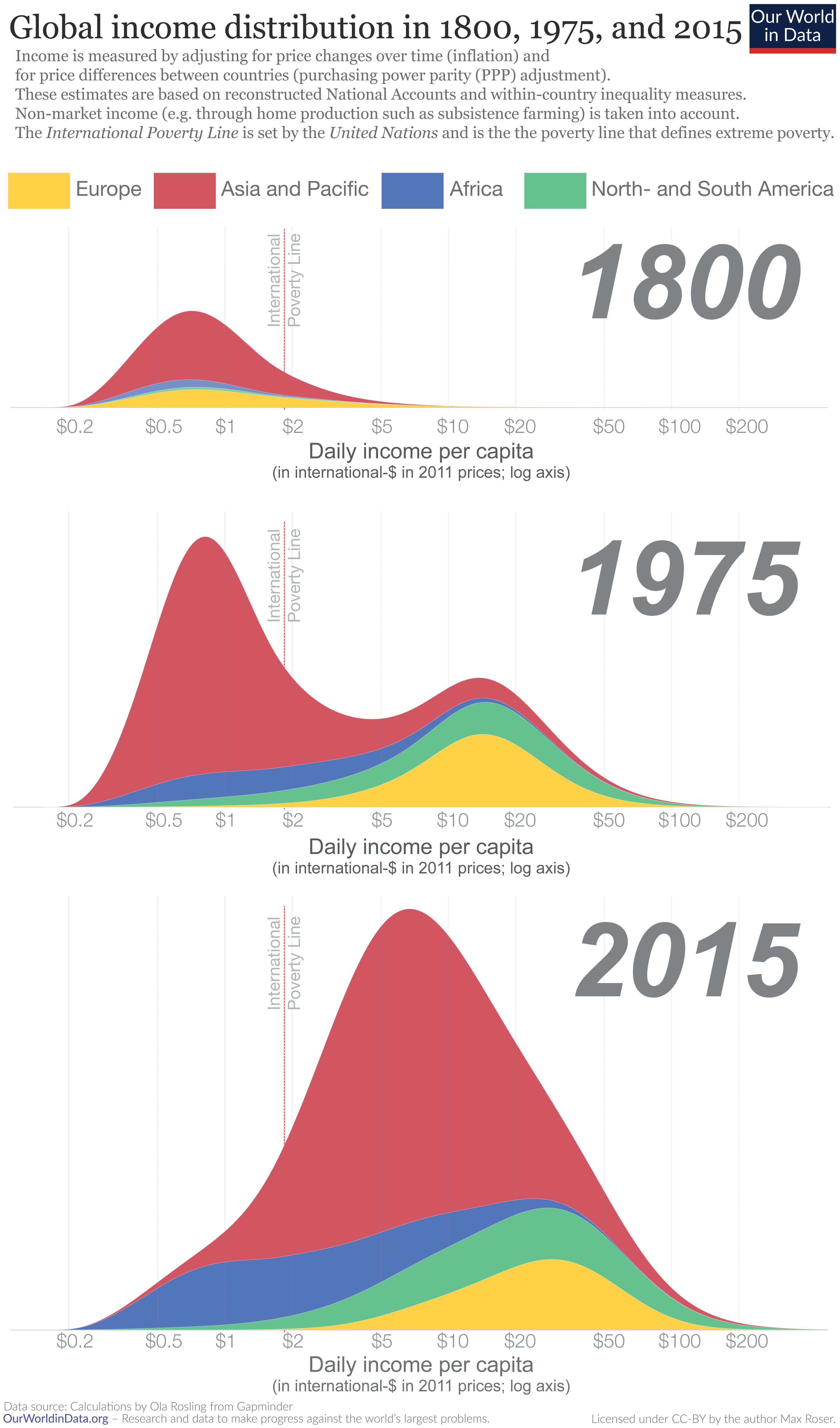
Global divergence followed by convergence
The chart shows estimates of the distribution of annual income among all world citizens over the last two centuries.
To make incomes comparable across countries and time, daily incomes are measured in international-$ — a hypothetical currency that would buy a comparable amount of goods and services that a U.S. dollar would buy in the United States in 2011 (for a more detailed explanation, see here).
The distribution of incomes is shown at 3 points in time:
- In 1800, few countries had achieved economic growth. The chart shows that the majority of the world lived in poverty with an income similar to the poorest countries today. Our entry on global extreme poverty shows that at the beginning of the 19th century the huge majority—more than 80%—of the world lived in material conditions that we would refer to as extreme poverty today.
- In the year 1975, 175 years later, the world had changed—it had become very unequal. The world income distribution was ‘bimodal’, with the two-humped shape of a camel: one hump below the international poverty line and a second hump at considerably higher incomes. The world had divided into a poor, developing world and a developed world that was more than 10-times richer.
- Over the following 4 decades the world income distribution has again changed dramatically. There has been a convergence in incomes: in many poorer countries, especially in South-East Asia, incomes have grown faster than they have in rich countries. Whilst enormous income differences remain, the world no longer neatly divides into the two groups of ‘developed’ and ‘developing’ countries. We have moved from a two-hump to a one-hump world. And at the same time, the distribution has also shifted to the right—the incomes of many of the world’s poorest citizens have increased and extreme poverty has fallen faster than ever before in human history.
Global inequality in 1800, 1975, and 20155
Global income inequality increased for 2 centuries and is now falling
This visualization shows the distribution of incomes between 1988 and 2011. The data was compiled by the economists Branko Milanovic and Christoph Lakner.6
To see the change over time, select the years just above the distribution.
The previous visualization, which showed the the change from 1820 to the year 2000 is based on estimates of inflation-adjusted average incomes per country (GDP per capita) and a measure of income inequality within a country only. It gives us a rough idea of how the distribution of incomes changed, but it is not very detailed and not very precise. In contrast to this, the work by Branko Milanovic and Christoph Lakner is based on much more detailed household survey data. This data measures household income at each decile of the income distribution and the two authors used this information to arrive at the global income distribution. The downside of this approach is that we can only go as far back in time as household surveys were conducted.
The visualization shows the end of the long era in human history in which global inequality was increasing. Starting with industrialization in North-Western Europe, incomes in this part of the world started to increase while material prosperity in the rest of the world remained low. While some countries followed the European industrialization – first Northern America, Oceania, and parts of South America and later Japan and East Asia – other countries in Asia and Africa remained poor. As a consequence of this, global inequality increased over a long period of time. Only in the period shown in this visualization did this change: With rapid growth in much of Asia in particular, the global distribution of incomes became less unequal. The incomes of the poorer half of the world population rose faster than the incomes of the richer half of the world population.
If you want to use this visualisation for a presentation or for teaching purposes etc. you can download a zip folder with an image file for every year and an animated .gif here.
Global Income Distribution 1988 to 20117
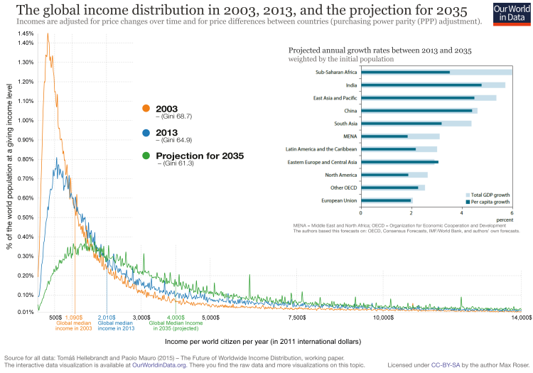
The latest data on global inequality and a look into the future
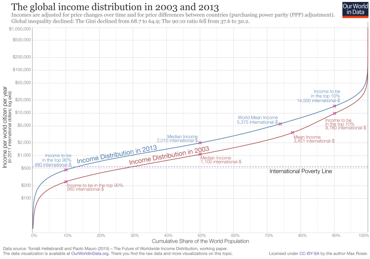
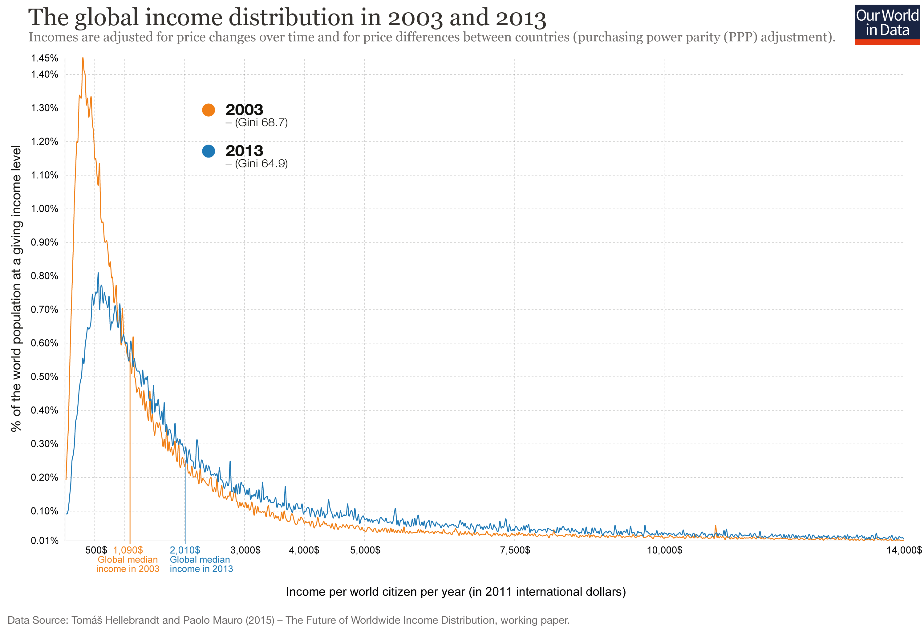
This visualization shows how the global income distribution has changed over the decade up to 2013. Tomáš Hellebrandt and Paolo Mauro, the authors of the paper8 from which this data is taken, confirm the finding that global inequality has declined: the Gini coefficient of global inequality has declined from 68.7 to 64.9.
The visualisations above show the income distribution on a logarithmic x-axis. This chart in contrast plots incomes on a linear x-axis and thereby emphasizes how very high global inequality still is: The bulk of the world population lives on very low incomes and the income distribution stretches out very far to the higher incomes at the right-hand side of the chart; and incomes over 14,000 international-$ are cut off as they would make this chart with a linear x-axis unreadable.
A second striking and very positive global development shown in this chart is the rise of the global median income. In 2003 half of the world population lived on less than 1,090 international-$ per year and the other half lived on more than 1,090 international-$. This level of global median income has almost doubled over the last decade and was 2,010 international-$ in 2013.
Finally, the authors also dare to make a projection of what global inequality will look like in 2035. Assuming the growth rates shown in the insert in the top-right corner, the authors project global inequality to decline further and to reach a Gini of 61.3. At the same time the incomes of the world’s poorer half would continue to increase strongly so that the global median income could again double and reach 4,000 international-$ in 2035.
If you are looking for a visualisation of only the observed global income distribution in 2003 and 2013 you find it here.
The global income distribution in 2003, 2013, and the projection for 20359
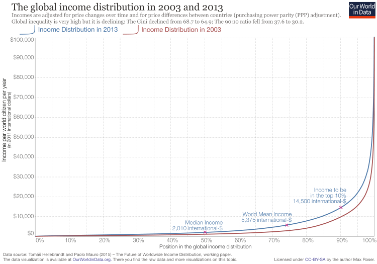
The following visualisation offers an alternative view on the data by Hellebrandt and Mauro10 shown in the chart before.
The chart shows the yearly disposable income for all world citizens in both 2003 and 2013. On the x-axis you see the position of an individual in the global distribution of incomes and on the logarithmic y-axis you see the annual disposable income at that position.
The increase in prosperity—and decrease of poverty—is substantial. The income cut-off of the poorest 10% has increased from 260 international-$ to 480 international-% and the median income has almost doubled from 1,100 international-$ to 2,010. Global mean income in 2013 is 5,375 international-$.11
The global income distribution in 2003 and 201312
The visualization presents the same data in the same way, except that the y-axis is now not logarithmic but linear. This perspective shows the still very high level of global inequality even more clearly.
The previous and the following visualisation show how very high global income inequality still is: The cut-off to the richest 10% of the world in 2013 was 14,500 int-$; the cut-off for the poorest 10% was 480 int-$. The ratio is 30.2.
While global inequality is still very high, we are now living in a period of falling inequality: In 2003 this ratio was 37.6. The Gini coefficient has also fallen from 68.7 to 64.9.
Taking the historical experience as a guide for what is possible in the future we have to conclude that global inequality will remain high for a long time. To understand this, we can ask how long it would take for those with incomes at the poorest 10% cutoff to achieve the current incomes of the richest 10% cutoff (which is 14,500 international-$). This income level is roughly the level of GDP per capita above which the poverty headcount gets close to 0% for most countries (see here).
How long does it take for incomes to grow from 480 int-$ to 14,500 int-$?
The global income distribution in 2003 and 201313
| 2% growth | 172.1 years |
| 4% growth | 86.9 years |
| 6% growth | 58.5 years |
| 8% growth | 44.3 years |
| 10% growth | 35.8 years |
Even under a very optimistic scenario it will take several decades for the poor to reach the income level of the global top 10%.
2% is roughly the growth rate that the richest countries of today experienced over the last decades (see here). We have seen that poorer countries can achieve faster growth, but we have not seen growth rates of more than 6% over a time frame as long as necessary to reach the level of the global 10% in such a short time. If the past is a good guide for the future, the world will very likely be highly unequal for a long time.
Inequality within countries and inequality between countries
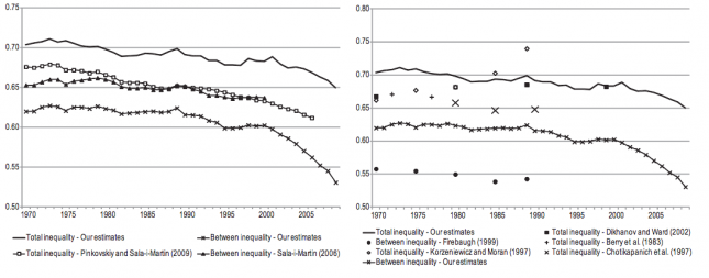
Global inequality is driven by changes both of the inequality within countries and the inequality between countries. This visualization shows how both of these changes determine the changing global inequality.
– Inequality within countries followed a U-shape pattern over the course of the 20th century.
– Inequality between countries increased over the course of 2 centuries and reached its peak level in the 1980s according to the data from Bourguignon and Morrison shown here. Since then, inequality between countries has declined.
As is shown in this visualization, the inequality of incomes between different countries is much higher than the inequality within countries. The consequence of this is that the trend of global inequality is very much driven by what is happening to the inequality between countries.

Global inequality is extremely high and on many of the previous charts incomes are plotted on a logarithmic axis. Here you see the change on a linear axis.
Growth convergence vs absolute income convergence, 1990-2003 – Todaro & Smith (2011)14