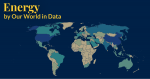
There are vast differences in energy consumption across the world.
We see this in the map, which measures per capita energy use.
The ratio between the US and India for example is around 12. This means that the average American consumes about the same amount of energy in one month as the average Indian consumes in an entire year. The average Brit consumes double that of the average Brazilian.
For the very poorest countries in the world, energy consumption is so low that it hardly registers. Beyond the burning of some solid fuels for cooking, people consume barely any energy at all. Increasing access to affordable energy in these countries is essential.
This metric captures the amount of domestic energy used in each country. It doesn’t include the energy used to produce goods that we import from overseas. In a related article we look at how energy use compares when we take this offshored production into account.
In our Energy Data Explorer you can explore many more metrics on energy, including total consumption by country; the sources that this comes from; and data on electricity – one subset of total energy use.