Think about how much energy you use. Some common things come to mind: electricity to keep the lights on; heating to warm your home; the car or bus you might take to get to work.
But there’s also the energy needed to produce the goods we buy in the first place. Sometimes these goods are produced in our own country – and so that energy is reported in our country’s energy use data. But when we buy goods from overseas, this energy is included in their accounts. It’s missing from ours.1
When we compare energy use across the world we rarely adjust for the energy embedded in imports. But what happens when we do? What difference does it make to our energy footprint?
Which countries are exporters and importers of embodied energy?
We can calculate how countries’ energy footprint changes once we adjust for traded goods. To do this we take a country’s domestic energy use – its production-based energy use. We then subtract the energy used to produce things that it exports, and add energy used to produce things it imports. The number we’re left with is its consumption-based energy use.
Researcher Viktoras Kulionis calculated this for all the countries with sufficient trade data available.2 Unfortunately the detailed trade data that is needed is not available for many smaller economies. This means that most low-income countries are missing.
In the map we see what countries are net importers and exporters of energy. Net importers are shown in red, and given as positive values. Net exports are in blue, as negative values.
I’ve calculated this energy embedded in trade as a share of each country’s domestic energy. So, Germany had a value of +15% in 2020. This means that its consumption-based energy use is 15% higher than its domestic energy use.
A fairly distinct global pattern emerges. Most of Europe – particularly Western and Southern Europe – and the United States are net importers of embodied energy. The average across these countries is that their net ‘offshoring’ is around 10-15% of domestic energy. This is less than many would assume. Low-to-middle income countries – China, India, Brazil, South Africa – are then net exporters of embodied energy.
Because energy use is the main driver of greenhouse gas emissions, we also see this pattern for carbon dioxide emissions embedded in trade.


How do production-based and consumption-based energy trends compare?
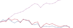
Let’s then look at the difference between production-based energy consumption, and how this looks after adjusting for trade (consumption-based). In the chart we see both metrics for Germany. In the previous map we saw that in 2020, Germany’s net trade of energy was equal to 15% of its domestic use. This tallies with what we see here: consumption-based energy use is 15% higher than production-based.
We can also see how this gap has changed over time. For Germany, it hasn’t changed much. This highlights an important point: many countries have managed to grow their economies without increasing energy use. As the consumption-based numbers show, this is not because they’re offloading manufacturing overseas. Consumption-based energy is also pretty flat.
You can explore this data for other countries using the “Change country” button on the interactive chart. If you switch to China, India, South Africa, or Brazil, for example, you will see that they are the opposite of Germany: production-based energy is higher than consumption-based because they are net exporters.


Where do people consume the most energy, after trade?
What does this mean for you and I? How does the energy footprint of people across the world compare when we take account of all of the things we buy and consume?
In the charts we see consumption-based energy use per person across countries – first as a map, and then as a bar chart.3
Unsurprisingly there are very large differences across the world. The average American consumes almost ten times as much energy as the average Indian. This doesn’t even include the world’s poorest countries. If they were included we’d see differences of at least 100-fold, if not more.4
We expect this gulf between rich and poor countries. But what is surprising is the differences between rich countries. Average standards of living are high in both the US and the UK. Yet the average American consumes more than twice the energy of the average Brit. Highlighting these differences could help us to develop economies, infrastructure, housing and transport networks that maintain a high standard of living in an energy-efficient way.
There’s another insight that goes against many people’s intuitions. Many middle-income countries consume a surprisingly large amount of energy per person. There’s a popular narrative that China has high energy consumption and CO₂ emissions because it produces so many goods for the rest of the world. This was true a decade ago – in 2007, China’s net exported energy was equivalent to 20% of its domestic energy use. But things are changing: in 2020 this was just 5%. The average person in China now consumes about the same amount of energy as the Spaniards or Portuguese.
Many manufacturing economies are emerging with high standards of living. Their energy footprints are a reflection of this.