Rich people use electricity or gas to cook. But 40% of the world do not have access to these clean, modern energy sources. What do they rely on instead?
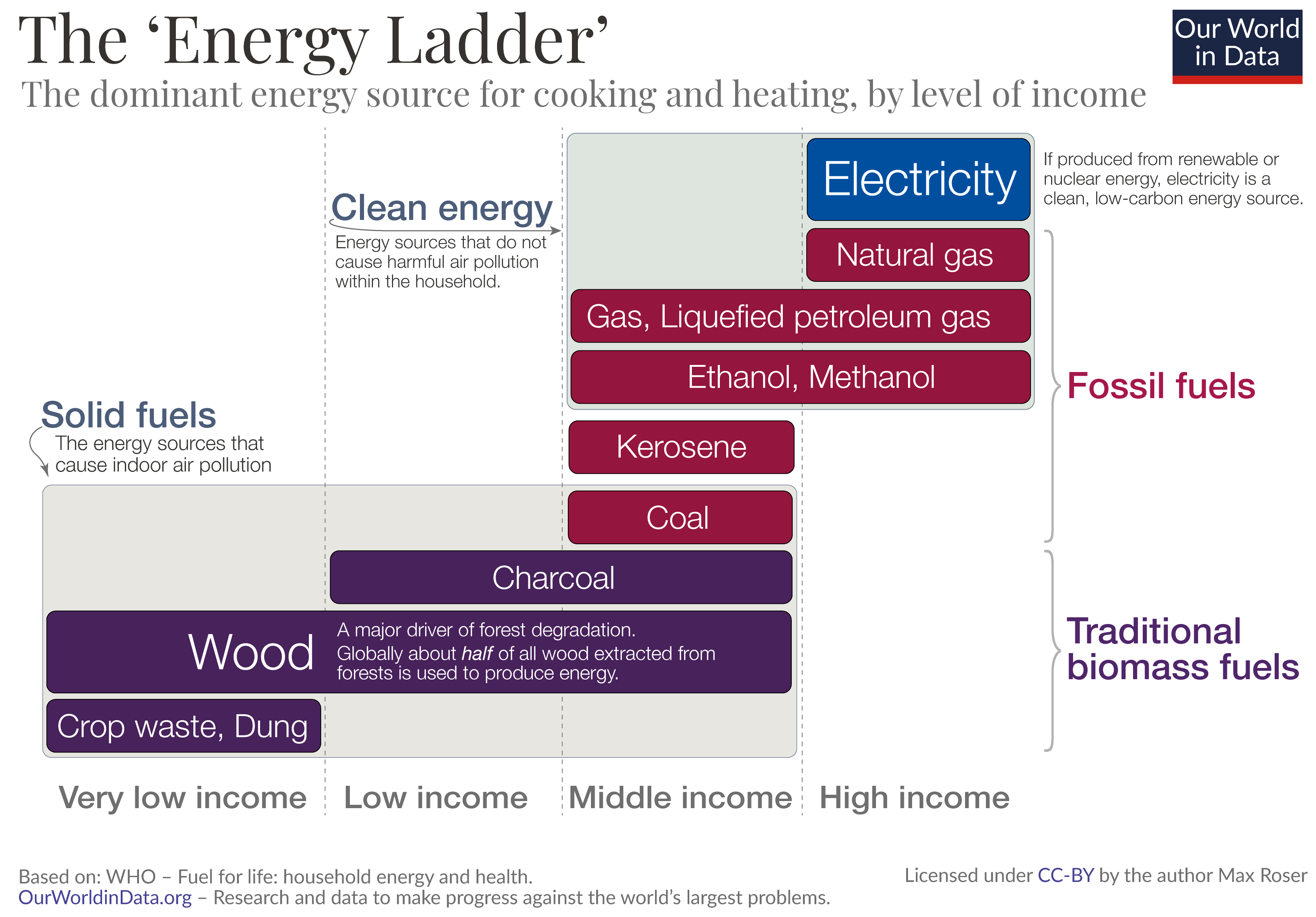
The visualization below is the World Health Organization’s answer. The so-called ‘Energy Ladder’ shows the dominant sources of household energy at different levels of income. From very low incomes on the left, to high incomes on the right.
The poorest households burn wood and other biomass, like crop waste and dried dung. Those who can afford it cook and heat with charcoal or coal.1
These fuels – from crop waste and dung on the left, to charcoal and coal in the middle of the visualization, are termed ‘solid fuels’. The other fuels, on the higher steps of the energy ladder, are termed ‘clean fuels’. When we track the share of households using clean fuels for cooking – an important metric in energy access – this is the definition of clean fuels that is used.
Why is access to clean fuels so important?
Burning solid fuels on open fires or simple stoves fills the room with smoke and toxic chemicals. These traditional energy sources expose those in the household – often women and children – to pollution levels that are far higher than in even the most polluted cities in the world. This indoor air pollution leads to millions of deaths every year. See our entry on Indoor Air Pollution for more information.
What is the empirical evidence for the relationship between income and energy source described by the ‘Energy Ladder’?
There are studies that look at this relationship on the household level.3
But even across countries the data shows how strongly access to clean cooking fuels differs between poor and rich countries.
The latest data on the relationship between a country’s average income and the access to clean fuels is shown in the scatterplot.
In most countries in which the average income is lower than $10,000 less than half of the population has access to clean energy. By switching this chart to show the change over time – either by adjusting the time slider or by clicking here – you see that the share who has access to clean energy tends to increase strongly as incomes grow.