What is the age structure of the world population and in countries around the world? How did it change over time and what can we expect for the future? These are the question that this entry focuses on.
The global median age has increased from just over 20 years in 1970 to just over 30 years in 2022. The global population breakdown by age shows that around a quarter are younger than 14 years, around 10% are older than 65, while half of the world population is in the working age bracket between 25 and 65.
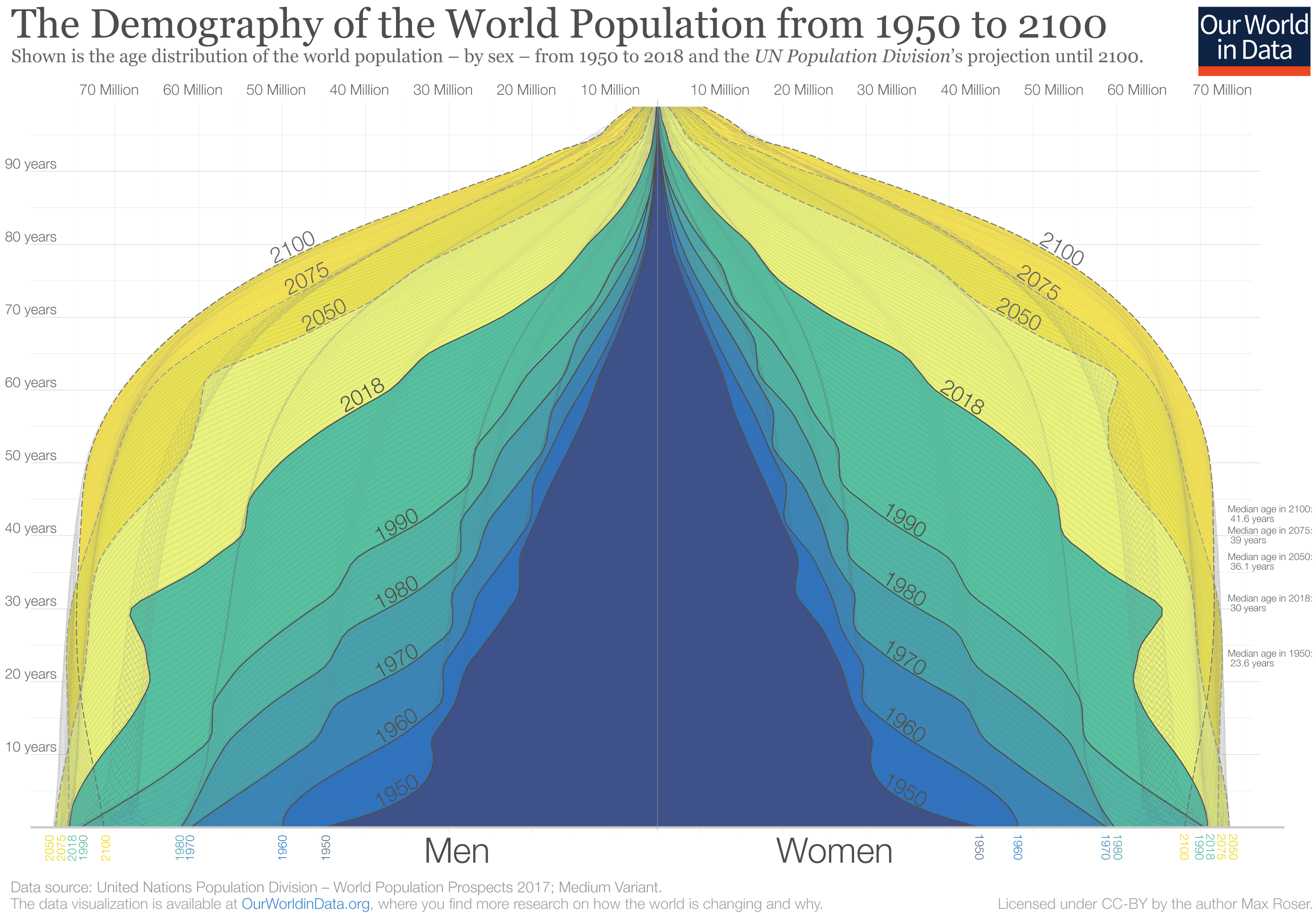
The global population pyramid: How global demography has changed and what we can expect for the 21st century
In 1950 there were 2.5 billion people on the planet. Now, there are more than 8 billion. By the end of the century, the UN expects a global population of around 10.4 billion. This visualization of the population pyramid makes it possible to understand this enormous global transformation.
Population pyramids visualize the demographic structure of a population. The width represents the size of the population of a given age; women on the right and men on the left. The bottom layer represents the number of newborns and above it, you find the numbers of older cohorts. Represented in this way the population structure of societies with high mortality rates resembled a pyramid – this is how this famous type of visualization got its name.
In the darkest blue, you see the pyramid that represents the structure of the world population in 1950. Two factors are responsible for the pyramid shape in 1950: An increasing number of births broadened the base layer of the population pyramid and a continuously-high risk of death throughout life is evident by the pyramid narrowing towards the top. There were many newborns relative to the number of people at older ages.
The narrowing of the pyramid just above the base is testimony to the fact that more than 1 in 5 children born in 1950 died before they reached the age of five.1
Through shades of blue and green the same visualization shows the population structure over the last decades up to 2018. You see that in each subsequent decade the population pyramid was larger than before – in each decade more people of all ages were added to the world population.
If you look at the green pyramid for 2018 you see that the narrowing above the base is much less strong than back in 1950; the child mortality rate fell from 1-in-5 in 1950 to fewer than 1-in-20 today.
In comparing 1950 and 2018 we see that the number of children born has increased – 97 million in 1950 to 143 million today – and that the mortality of children decreased at the same time. If you now compare the base of the pyramid in 2018 with the projection for 2100 you see that the coming decades will not resemble the past: According to the projections there will be fewer children born at the end of this century than today. The base of the future population structure is narrower.
We are at a turning point in global population history. Between 1950 and today, it was a widening of the entire pyramid – an increase in the number of children – that was responsible for the increase of the world population. From now on is not a widening of the base, but a ‘fill up’ of the population above the base: the number of children will barely increase and then start to decline, but the number of people of working age and old age will increase very substantially. As global health is improving and mortality is falling, the people alive today are expected to live longer than any generation before us.
At a country level “peak child” is often followed by a time in which the country benefits from a “demographic dividend” when the proportion of the dependent young generation falls and the share of the population of working age increases.3
This is now happening on a global scale. For every child younger than 15 there were 1.7 people of working age (15 to 64) in 1950; today there are 2.6; and by the end of the century, there will be 3.6.4
Richer countries have benefited from this transition in the last decades and are now facing the demographic problem of an increasingly larger share of retired people who are not part of the labor market. In the coming decades, it will be the poorer countries that can benefit from this demographic dividend.
The change from 1950 to today and the projections to 2100 show a world population that is becoming healthier. When the top of the pyramid becomes wider and looks less like a pyramid and instead becomes more box-shaped, the population lives through younger ages with a very low risk of death and dies at an old age. The demographic structure of a healthy population at the final stage of the demographic transition is the box shape that we see for the entire world in 2100.
The Demography of the World Population from 1950 to 21002
The median age provides an important single indicator of the age distribution of a population. It provides the age ‘midpoint’ of a population; there are the same number of people who are older than the median age as there are younger than it.
On the map, we see the median age in all countries in the world.
The global average median age was 30 years in 2021 – half of the world population were older than 30 years, and half were younger. Japan had one of the highest median ages at 48.4 years. One of the youngest was Niger at 14.5 years.
Overall we see that higher-income countries across North America, Europe, and East Asia tend to have a higher median age.

Lower-income countries tend to have a lower median age. This is because they have a ‘younger’ population overall: high fertility rates across these countries mean they have larger populations of young children and adolescents.


The age structure of a population has important impacts for various aspects of society: economic growth rates, labour force participation, educational and healthcare services, housing markets amongst others.5,6
Over the past century, the age structure of populations has been changing dramatically.
In these two charts you can compare the population structure by broad age groups for two example countries: Japan and Nigeria. This is shown from 1950 onwards. Here there are two key points to notice.
- There are large differences in the age composition of the two countries. Nigeria has a much younger population: in 2021, around 43% of Nigerians were under 15 years old. In Japan, their share accounted for around 12%. Japan has a much older population: in 2021 more than a quarter were 65 years and older. Less than 3% of Nigerians fell into this age bracket.
- We also see a major ageing transition in Japan over the past half-century. In 1950, more than half of its population were under the age of 25. By 2021 this had more than halved to less than a quarter (21%). Instead, the share of those over 65 years old has increased more than six-fold, from less than 5% in 1950 to almost 30% in 2021.


As we discuss in our exploration of dependency ratios, this distribution between working age versus young and old (dependent) populations is important for the economic and social functioning of societies.
This breakdown is shown in the visualization. You can explore this data for any country using the “change country” button on the interactive chart.
It is common in demography to split the population into three broad age groups:
- children and young adolescents (under 15 years old)
- the working-age population (15-64 years) and
- the elderly population (65 years and older)
A large share of the population in the working-age bracket is seen as essential to maintain economic and social stability and progress. And since a smaller share of the younger and older population is typically working these two groups are seen as ‘dependents’ in demographic descriptions.
A large fraction of economically ‘dependents’ relative to those in the working-age bracket can have negative impacts for labour productivity, capital formation, and savings rates.7
Demographers express the share of the dependent age-groups using a metric called the ‘age dependency ratio’. This measures the ratio between ‘dependents’ (the sum of young and old) to the working-age population (aged 15 to 64 years old).
The age dependency ratio across the world is shown in this map.
It’s given as the number of dependents per 100 people of working-age. A value of 100% means that the number of dependents was exactly the same as the number of people in the working-age bracket. A higher number means there are more ‘dependents’ relative to the working-age population; a lower number means fewer.
We see big differences across the world. The majority of countries have a ‘dependent’ population that is 50-60% the size of its working-age population. The ratio is much higher across many countries in Sub-Saharan Africa: Niger and Mali, for example, have a larger dependent population than they have working-age populations. As we see in the next section, this is the result of having very young populations.

How do dependents vary across the world?
In the map above we considered the ‘dependent’ population – both young and old – as a single group. But the split between young and old populations varies also significantly across the world.
In these two charts we see the breakdown of age dependency by young and old populations for two contrasting countries: Japan and Nigeria.
As we see, Japan has a much older population: in 2021, there were more than twice as many above 64 as there were children younger than 15. This has not always been the case, as the chart shows. Japan has aged significantly in recent decades: in 1950, there were over 7 children younger than 15 for every person above 64.
The opposite is true in Nigeria. Almost 94% of dependents there are young.
You can explore this data for any country using the “change country” button in these charts. You’ll notice fairly consistent patterns: higher-income countries with low fertility rates and longer life expectancies are dominated by an older population. The opposite is true for lower income countries with high fertility rates.


Youth- and old-age dependencies across the world
We can also see this distribution of young and old populations across the world clearly in the two maps below. These again show the age dependency ratio, but are now split between young (under 15 years) and old (65+ years) dependency ratios.
Whilst the total age dependency ratio is a useful indicator, understanding the breakdown of this dependency between young and old is key. The needs, behavior and future pathways for young and old populations is very different. This has important implications for national planning, spanning everything from education and healthcare services, to labour supply, savings rates and pensions.
The young dependency ratio is high across Sub-Saharan Africa in particular. Some countries in this region have close to the same number of young people as they have working-age population. The youth dependency ratio is much lower across higher income countries since fertility rates tend to be much lower there.

The old-age dependency ratio is almost a mirror image. Higher-income countries – particularly across Europe, North America and East Asia – have the highest dependency ratios.

What matters more for dependency: age or labor participation?
[Many thanks to Nicholas Gailey, of the World Population Program at the International Institute for Applied Systems Analysis (IIASA), for providing the content for this section].
Age is one of several factors needed to tell the full story on dependency.
Conventionally, age is assumed to have a direct relationship to productivity. It’s used to identify who is a worker and a dependent, with productive life beginning at 15 and ending at 65. However, measures of dependency based on chronological age alone can be misleading.8
Cultural questions such as an acceptable age of retirement, delaying work for education, and the role of women in the labor force vary greatly by country and across time. Average teenagers in rural Sudan, who end their education after seven years to work on the family farm, contribute much earlier and differently over the life course than average urban South Koreans who spend time consuming education for another decade into their mid-twenties.
The reality of aging itself is not even constant. Thanks to medical advances, improved nutrition, and less demanding lifestyles, 65-year-olds in most countries can expect not only longer lives, but more years in good health, than their parents or grandparents.
These factors all make it difficult to use age-dependency for drawing comparisons or assessing economic troubles – specifically, a breakdown in the balance between workers and non-workers.
Alternative types of ‘dependency ratio’ can capture at least some of the nuances. The Labor Force Dependency Ratio (LFDR) is useful for this purpose, showing the number of people participating in the labor force relative to those not in the labor force. ‘Participation’ in this context is defined as people working or actively searching for work.
Projections for the EU and UK show that regardless of possible developments in fertility or migration, there is clear, unstoppable momentum towards population aging.9This prospect is common to nearly all industrialized societies. Whereas the aging is inevitable, labor participation can change and play a decisive role in determining the future of dependency.
The interactive chart here shows projected changes in ‘dependency’ between 2015 and 2060. The change in these dependency ratios is shown relative to their 2015 values (which were each set at ‘100’ for the start of the projection).10 You can explore this data for all EU-27 countries and the United Kingdom using the ‘Change country’ toggle on the interactive chart.
The scenarios illustrate a range of pessimistic and optimistic outlooks, depending on if you use the Age Dependency Ratio (where we do not account for labor force participation past the age of 65), the Labor Force Dependency Ratio (which covers everyone participating in the labor force), or a LFDR scenario that assumes gradual improvements in labor participation (e.g. to the levels seen in 2015 Sweden by the year 2060).11
Even though the LFDR is still expected to climb, it suggests more flexibility. If Europe were to move closer to higher participation rates among its adult (both under and over-65) population (as for example in Sweden, Czechia, Germany, or the Baltic countries), then much of the feared rise in dependency would fail to materialize. To the extent that is achievable, education systems must be more responsive to in-demand skills and relevant to the broader economy.

The world population is changing: For the first time there are more people over 64 than children younger than 5
Countries across the world have been going through an important demographic transition: from young to increasingly ageing populations.
In 2018 the number of people older than 64 years old surpassed the number of children under 5 years old. This was the first time in history this was the case.12 We can see this transition clearly when we look at the population by age bracket in the chart – this is shown from 1950 onwards, with UN projections to 2100.
In this chart you can explore the projected age structure of future populations – for any country or world region. Just click on Change Country in the bottom left.
Going beyond the global perspective, when did this crossover point occur in countries around the world?
The timing varied significantly between countries – in higher income countries with low fertility rates and longer life expectancies, it has been shifting for decades. In the United States, under-5s were already outnumbered by those older than 64 by 1967. In Spain it was 1970; in South Korea it was 2000.
For many countries, this crossover point is still to come. In India, it’s projected to be 2026. In South Africa, it’s expected to happen in 2035. In low-income countries with high fertility rates and lower life expectancy this point is still many decades away: it’s projected that in Nigeria, under-5s will outnumber those older than 64 until 2080.
The number of children under 5 years old has peaked and is projected to plateau then fall for most of the 21st century. And as the global population of people older than 64 years will continue to grow, it’s clear that we’re moving towards an ageing world.

Demographic opportunities and challenges: dividends and aging populations
Different countries face different challenges. Lower-income countries with high fertility rates typically have a very young population; a large share of the population are children who aren’t (or shouldn’t) be in the productive working population. High-income countries with a large elderly population face the same challenge for working-age populations.
But how is this expected to change in the future? In the two charts we see the breakdown of two example populations – Japan and Nigeria – by age between young (under 15 years old), working-age (15-64 years old) and elderly (65+ years old). This is shown until the year 2100 based on the UN’s population projection.
For Japan, and other high-income countries, it’s expected that the older demographic over 65 years old will continue to increase in the coming decades. Since the youth share is not expected to change significantly, this means the share of the population of working-age is expected to fall further.
Nigeria currently has a very young population. But these children and adolescents will move into the working-age bracket soon and share of the productive, working-age population will increase significantly in the coming decades.
As fertility rates continue to decline, it’s expected that the working population as a share of the total population will continue to increase throughout this century.


Projections of the age-dependency ratios
From an economic perspective, the changing age structure generates very different opportunities and challenges across the spectrum of countries.
For Nigeria, the share of the working-age population will increase relative to the ‘dependent’ population as the chart shows. The dependency ratio is expected to decline throughout this century and because its working population has less people to support this provides a window of opportunity for more rapid economic growth – the so-called ‘demographic dividend’.13
But as research shows: taking advantage of this opportunity is not a given. India – as the second-most populous countries and a country that has seen rapid decline in fertility rates in recent decades – has had a large potential demographic dividend. You can view its age dependency ratio in the chart by switching to India with the “change country” button. Here we see that the age dependency ratio in 1970 was almost 80%: a very young demographic. Since then it has fallen to below 50%, and is expected to fall until the mid-2030s.
Studies, however, suggest that despite impressive rates of economic growth, India has failed to take full advantage of this possible demographic dividend. To reap the benefits of this demographic transition a few conditions are required: the labour market and jobs need to be available for young adults to move into; and the employability status of the youth needs to be suitable to fill these jobs. Studies suggest that the absorption of India’s youth into the workforce has not been as high as expected.14 Youth unemployment rates are high, and educational and health deficits are prevalent.15 This limits India’s ability to achieve very high economic growth despite a large working-age population. Although it’s recognized that this demographic transition has had positive impacts for India’s growth, educational and health deficits combined with poor job creation means it hasn’t fully taken advantage of its low dependency ratio.16
The demographic dividend from a rapid reductions in fertility rates can provide a major opportunity for accelerated economic growth. But maximising this potential needs a strong policy environment for education, health and job creation. If lower-income countries can achieve this, they could see major economic gains throughout the 21st century.

